
Logos
Updated Logo: This logo now appears to represent MMPR as a whole replacing the old grainy icon used above in previous seasons.
Power Rangers 20th Logo: When Power Rangers turned 20 this logo was used for many events held by Saban Brands including the Ranger takeover of New York and Power Morphicon in 2012.
MMPR Reversion Logo: This terrible looking logo appeared during Disney’s reversion of Mighty Morphin’ in 2010. The logo not only appeared in the reversion’s opening but on all toys released during that year. The logo has since, luckily, disappeared.
MMPR “Celebrating 20 Years” Logo: This logo appeared on many of Saban Brand’s licensed products including the Morph Suits and Figuarts released in the US. As well as anything celebrating the 20th Anniversary of MMPR alone.
Disney Product Logo: This Logo was rather generic appearing on several “Legacy” or anniversary-like products, like video-games during the Disney Era.
Mighty Morphin’ Power Rangers: The Movie (1995): The logo was metalized in 1995 when the Mighty Morphin’ Movie premiered.
Power Rangers Saban/Hasbro Logo: After leaving Bandai for Hasbro, Saban Brands decided to completely change the logo by using a new font with different colors the sides of the logo and a classic yellow lightning bolt.
![]()
When Mighty Morphin’ Alien Rangers premiered in early 1996 the logo was changed for the very first time to reflect the change in Ranger teams. Instead of the bolt slamming into a marble surface, it would instead twist and strike in between a circle of words. This lightning bolt would reflect the logo embroidered onto the Aquitian Rangers’ uniforms.
![]()
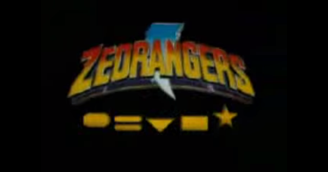
At first the Power Rangers name was changed drastically when for a few promos, VCDs and international episodes the Power Rangers was changed to ‘ZeoRangers” which reflected a more Sentai like naming.
Later the logo we all know today was changed to reflect Power Rangers Zeo; the lettering was changed to gold while the bolt went to silver amongst a blue-green background.
![]()
During Turbo the logo was changed to silver for the first time in the TV series. Below the Power Rangers name was a fast moving “Turbo” to reflect the new speed of this season.
For the Turbo Movie the logo was drastically changed with the word Turbo taking over the logo. This logos rather cartoonish but only appears on certain posters and DVD covers.
![]()
![]()
When the Rangers rocketed into space the logo changed to a more green-ish blue that we will begin to see for another few years.
Behind the logo of “in Space” are stars in the galaxy to reflect the season. Before its final version this logo had a previous variation.
This was also the first logo, on the show that is, to feature the word “Saban’s”
![]()
![]()
Not much changed between Space and Lost Galaxy but the addition of the new wording and a different galaxy behind the logo.
![]()
Lightspeed Rescue had a slight change but barely. Flashing lights and sirens were added this time.
![]()
Time Force, while keeping the same blu-ish green tone we’ve seen for a while, we were given sparking effects and a time warp behind the logo.
![]()
Finally a change! The Wild Force logo was a vast difference between the last three years. This logo featured the eyes and fangs of a beast as well as the fiery brush strokes of the title! It even roared in the opening credits!
![]()
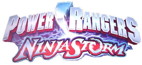
As Disney began designing the logos we finally strayed away from the blue green we’d been seeing for many years. In this logo the title has gone to red and silver. Before its final version this logo had a previous variation.
In the show’s opening the lightning bolt sparked and the stormy lettering whirled!
![]()
For the first time the Red Ranger’s Zord strikes his tail as it becomes the famous thunder bolt!
A very cool twist on the logo!
![]()
Power Rangers SPD revisited the sirens first seen in Lightspeed Rescue but more outwardly.
However, what was even cooler was that the letters and the thunderbolt chase and strike an SPD patrol car during the opening credits!
![]()
Mystic Force featured a spell seal background and a new deep purple, and in some instances a ghostly blue like in the tv opening, Power Ranger icon with thunder bolt! Mystic Force is written in wizardly scroll!
It has been noted that the lettering was also changed back to the Red color as the previous logos had been.
![]()
![]()
Operation Overdrive went back to the now standard red and silver Power Ranger icon but featured a treasure hunter style font and the spinning compass behind.
![]()
Jungle Fury’s logo is similar to Wild Force in that it both roars and and has fang shaped letters on the logo.
Either way too cool to see the Zord’s strike the logo!
Check out the Pilot logo below! Which is better?
![]()
![]()
RPM went along the same lines as Turbo, this time a large tire was added to the background to run in a fast speed!
Below the letters RPM displayed the standard thunder bolt.
![]()
![]()
As Saban reacquired Power Rangers after RPM and the horrid re-versioning mentioned above, the words “Saban’s” was added once more.
For Samurai and Super Samurai the lettering was changed to an Asian style while the lightning bolt was turned gold for the first time since MMPR!
![]()
![]()
Megaforce, along with it’s name, has to be the most boring logo we’ve ever seen. The bolt was turned back to silver with an orange explosion like color to it. The word Megaforce is in no way excited or endearing. What a disappointment.
![]()
Super Megaforce did not do much a of a job to improve. However, the sabers were added a the bottom while the word “Super” was turned to red. The word “Saban’s” remains gold.
![]()
![]()
Dino Charge is a major improvement over the last few years! The lettering of “Dino Charge” has a scales while sitting inside of a large toothed mouth filled with lightning! Some changes were made to the logo between the beta and complete logos.
![]()
The very top image is of the finished official version in promos and on the new toys, the one above is a very early beta version.
![]()
The very last image is another variation from a press release.
![]()
The New Movie Logo Sports A New Thunderbolt And Silver Lettering.
![]()
![]()
Ninja Steel’s logo has a space-like background complete with silver colored lettering with a shuriken in the middle.
![]()
The Hyperforce logo has basic white lettering with a purple background with the Hyperforce logo in the middle.
![]()
The Beast Morphers logo would use light green lettering inside a dark green background.
![]()
Dino Fury uses metallic lettering, spikes on the side and a T-Rex head in the middle.
![]()
The 30th Anniversary Special revisits the classic MMPR Logo with added neon lightning in the lightning bolt.
![]()
Cosmic Fury uses golden metallic lettering inside an upside down triangle with a T-Rex head on the bottom.
You must log in to post a comment.